Wearwell: Flow Thru
Product Identity | Brand Extension | Marketing Collateral
The Challenge
Wearwell, an established industry leader in safety floor mats, needed a visual identity for their new Flow Thru product line — on that extended the parent brand while giving the product its own recognizable presence within the broader Wearwell family.
The Approach
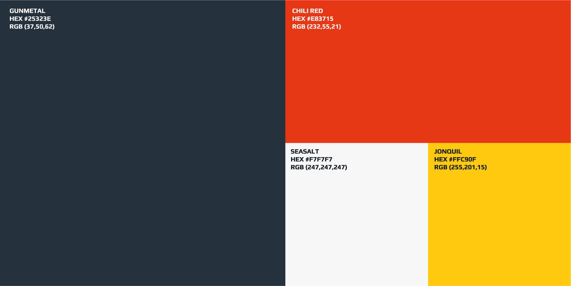
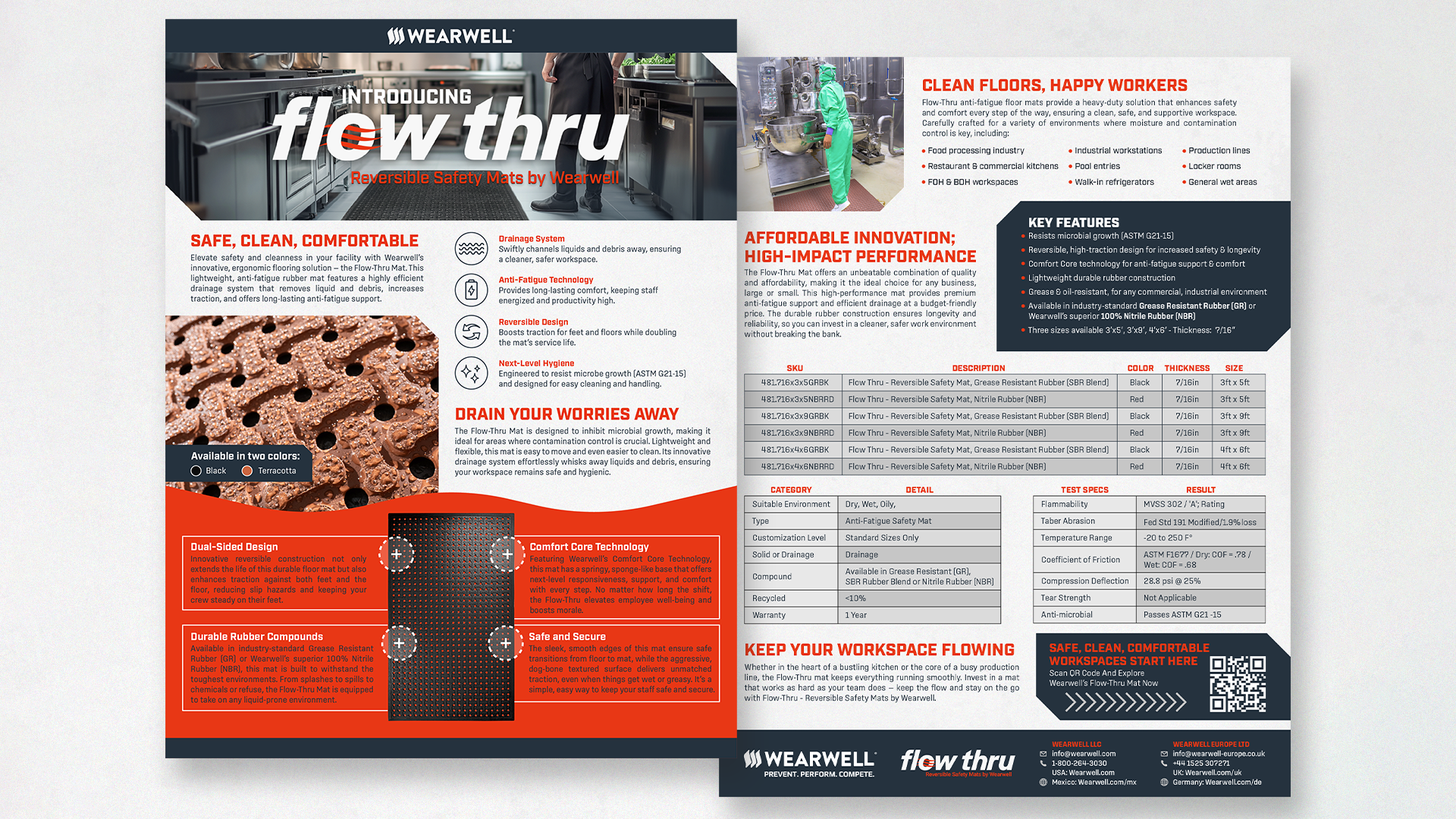
The design challenge was balance: create enough visual distinction for Flow Thru to stand on its own while maintaining brand coherence with Wearwell’s existing product ecosystem. I developed a logo system and color palette built for recognition across both large-format and tactical marketing contexts.
The Outcome
Delivered a complete product identity system — logo, color palette, and marketing assets — adopted as the official identity of the Flow Thru Line.